SolutionOne Blog
Is the World Ready for Windows 8?
We've seen a pattern over the years as Microsoft releases operating systems where every other operating system is great, while the releases in between are somewhat lacking. Windows 98 was pretty solid, as was XP, however the middle-child Windows ME? Not so much. This kind of progression is usually reserved for Star Trek films. What does this mean for Windows 8, the successor of the great Windows 7?
Microsoft is certainly doing things a little different this time around as well. Of course, over the past few years, Microsoft has had to step a little out of their normal bounds. They had to take cues from other big names, such as Apple, who's products deliver more than just functionality, but elegance and style. Microsoft has needed to switch gears because Google, Apple, and plenty of other companies have been releasing rival products. While as an operating system and developer of business productivity apps, Microsoft is still by far dominating the market, they need to keep up with the rest of the world to retain that title.
Windows 8 will (or will try to) be the new face of Microsoft. This is the slicker, streamlined Microsoft they want you to see, but underneath it all is still the same reliable Windows you are used to, but there are some awkward user interface differences that aren't quite clear in the consumer preview.
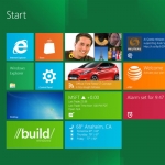
The Windows 8 Metro interface works a lot like you'd expect on a smartphone or tablet. In fact, that's what it is built for - designed for touch displays with features like widgets and information aggregators, touch-based navigation, and even an apps marketplace. This is pretty exciting for the tablet market, but for workstations it doesn't feel quite as natural to some users. There's a bit of a learning curve, and a lot of features (especially when it comes to navigation) that just aren't perfectly clear. For example, in the consumer preview Microsoft has done away with the traditional Start Menu. The bottom left corner is barren of anything unless you drag your mouse down to it, where a button pops up that sends you back to the Metro app interface.
Innovation is a great thing, but interfaces need to feel natural to the people they are intended for. For users who are very familiar with smart phones and tablets, Windows 8 might be a natural step forward, but for users who aren't quite as technically savvy, they might need a half hour of training to get accommodated to the new system.
Of course, the preview isn't the official release of Windows 8 - Microsoft is letting the world get a feel for the operating system, so real judgments can't be made just yet. Beyond the interface, there are tons of improvements and tweaks to Windows 8 that do improve upon Windows 7, and since 8 is designed to be scalable, the idea of having a full desktop OS on a 10 inch mobile tablet is pretty exciting.
What do you think? Are you excited about the changes in Windows 8 or do you feel it just complicates something that already works? Leave a comment!

Comments